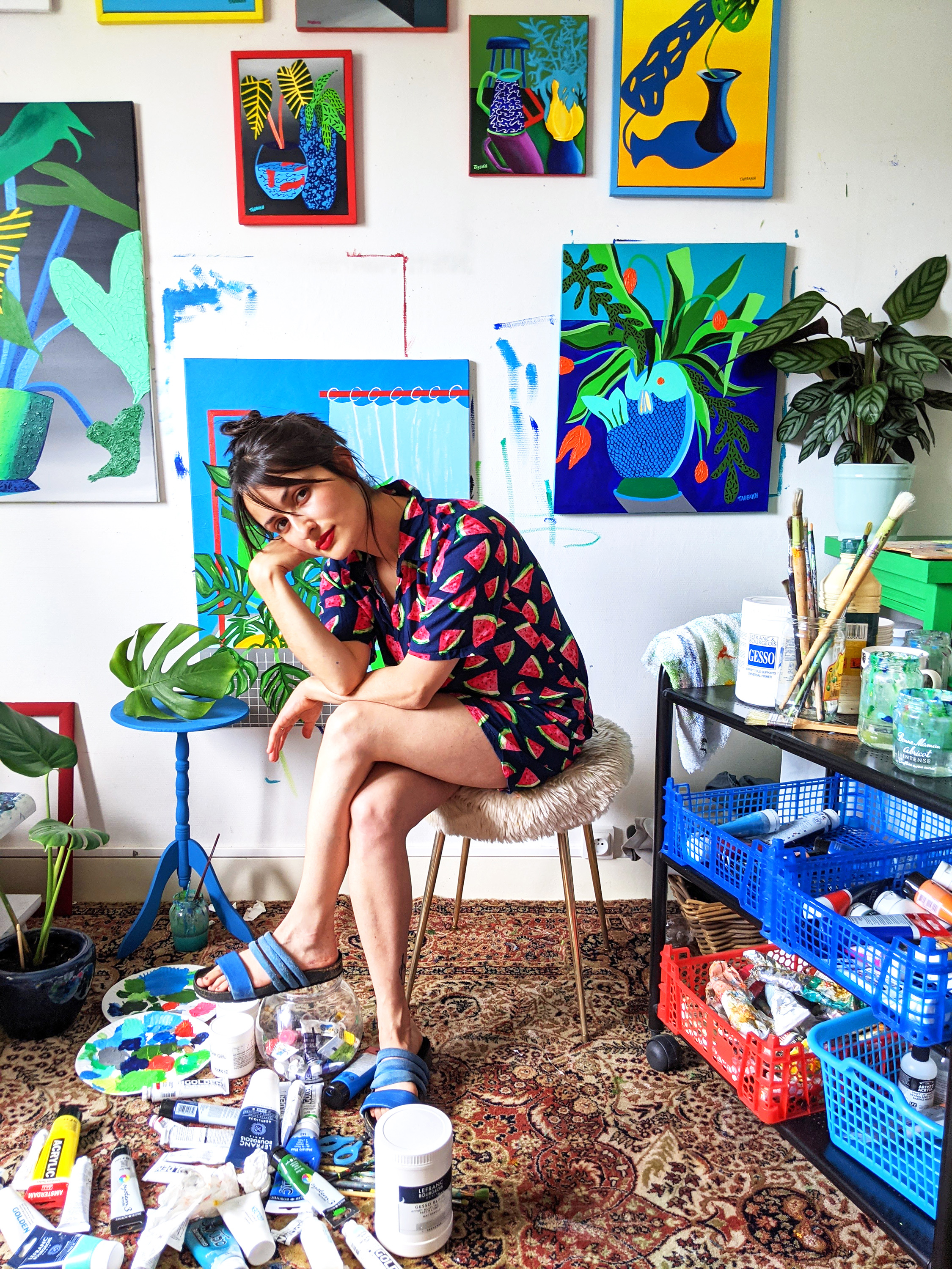
Cathy Tabbakh
You work between France and the UK. Do you draw from the painting traditions of both countries, or do your influences come from elsewhere?
I get inspired by many different traditions. I collect antique vases and pots, often from flea markets or antique stores from all over the world. I have a fascination for ornaments and various surrealistic objects such as leaf plates, a watermelon letter holder or a lemon salt and pepper shake, these are a few of my own objects. I get inspired a lot by what’s around me and will add a surrealistic twist to it. I also think I kept some influences that I studied in art history and archaeology. My parents were greengrocers, so I have always been drawn to food and market / garden life.
Some of the objects in your paintings are realist and others more expressionist. What effect do you hope to achieve by this combination of styles?
I don’t like to obey a certain style or composition, I love the freedom I get in my work. I enjoy mixing various inspirations and styles to make it my own.
Your still lifes of flowers in vases have dramatic titles and a strong sense of mood and the passage of time. How do you think the still life form can contain all this emotion and time?
I feel like the fusion between shadow and light is very powerful. The shortness of this moment, waiting for that glowing golden hour to touch the still life. You never know how it’s going to react and it’s never exactly the same. I find that fascinating and it definitely changed the way I work and the way I see light. All my work used to be very 2D and flat, since the last couple of years I’m working more in 3D, thinking of how the composition could feel more voluminous by the use of shadows and various textures.
Your paintings often have strong light sources that create shadows, and sometimes the shadows are exaggerated. What do you convey with shadows?
Depending on where the shadow is coming from, the shadow can be exaggerated or blurred naturally. I chose to interpret it in a more surrealist way. I don’t wish to copy exactly what I see but give it my own interpretation. I usually saturate the palette a lot, to give it a more dramatic aspect.
Some of your compositions have a playful, geometric architecture. Are you referring to a certain modernist architecture? Do you consider your paintings from an architectural perspective?
I play around different themes in my work: still lifes with shadows, surrealistic stills, architectural compositions and bathroom scenes. I get inspired by many architects but I’m particularly keen on Luis Barragàn’s work that I discovered some years ago. The way he thinks of lines and colour is amazing and mesmerising. Even in my still lifes with shadows, there’s always a game of lines. The light is depicted in a very straight, angular and architectural way.
What about plant life, and its interaction with vases, interests you? And how does this relate to your interest in water and marine life?
I collect plants, I love watching them grow and the way that they seem to be constantly dancing, in movement. They can also be surprising! During the second lockdown in the UK, I started painting fish in bowls, unconsciously. I then realised the symbolism behind it. I was myself feeling like a fish in a bowl, able to see the world but not touch it. I have since been painting many different fish and tried many different combinations. My favourite so far remains the fish vase. This is a theme I am still in constant exploration.
Click Here ︎ to see Cathy’s work.
Cathy’s Instagram: @cathytabbakh
Interview by Christian Prince.
@chrstn_francis
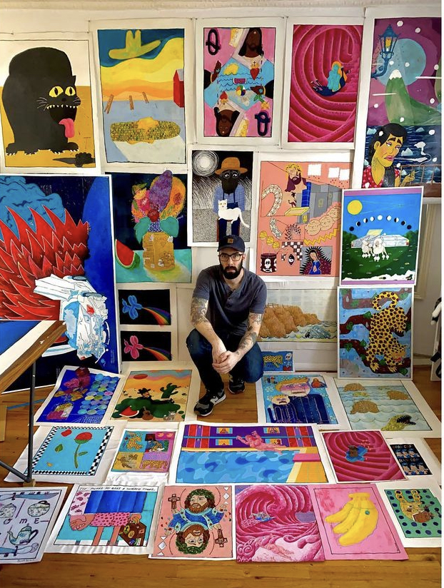
Jake Plissken (Jacob Gerard)
Your style, especially in your figures, can appear cartoonish, but it also has this rough realism, like in your depiction of Mickey Mouse, where you humanize him with small eyes and dark circles. How would you describe your style?
No clue. Trying to describe what I do, or even how or why I like something is really hard for me. I’m horrible at expressing myself verbally. That’s why I enjoy painting. I can sit there and spend a week or two on a single image or thought, taking one image I like and then painting it in the colors I think compliment it, tediously painting and repainting it until I feel like it is a coherent thought.
I wish every conversation I ever had could be more like that. The first time I try and express a thought, it always comes out all jumbled and non-sensical, like I’m just stringing together random sentences.
I wish I could go back and layer in new words, sentences, thoughts, ideas until I get something that seems more like a clear expression of myself and my feeling on the subject, ya know?
Your colors are disarming and distinctive. You seem to take familiar, primary colors (blue, red, yellow), and alter them just enough that they become weird and unfamiliar. What role does color play in your compositions?
My style has altered in the last few months, especially in the way I use color, so it’s hard to speak on the way I use composition. I honestly just go with my gut a lot of the time.
Lately, I’ve been starting by painting everything a cool blue then layering warmer colors on top. I usually know what color I want to work around, like in the last cowboy painting I did, I knew I wanted a red shirt and that was it. After that, I just kept changing the colors around until everything seemed balanced. Sometimes in the painting I feel like the color plays a more important role then the image itself.
You paint big and small cats. There’s one painting where a big, gothic black cat is panting over the universe. Do cats hold any sort of totemic significance for you?
Ya, I love cats. I grew up with a lot of animals, dogs, cats, crows, pigeons, snakes, rabbits, lizards, even a possum for a few weeks once; you name it. But I always felt the most connection with my cats. Like when you have a cat as your friend, you know that’s a real friend. That’s your buddy. That cat can be anywhere, do anything it wants. So if it’s hanging out with you it’s because it wants to, because it really loves you. Unlike dogs, I mean I love dogs a lot, but they’re idiots. They just love you because you feed them, and they just need you most of the time. So ya I guess I put cats on a pedestal…they’re cool.
Also they have this vibe like they know something you don’t, Like their third eye is open and they’ve seen through the multi-dimensions stacked ontop of eachother like glass plates playing out every infinite scenario. So they know what could have happened and what’s going to happen and none of it really matters because we’re all just going to be reincarnated as bushes so eat and nap all you like.
Many of your scenes are distinctively American—there’s western scenes with cowboys, and a scene of a woman diving into a motel swimming pool. Do you think about Americana when you paint?
Oh yeah, for sure. I’ve really been leaning into it lately. It’s honestly kinda subliminal to me, not really a cultural criticism or anything. If anything, it’s a critique on the inner workings of my brain. I don’t even realize I’m doing it, like It’s all just so engrained into my brain like some MK ultra shit. I guess that’s a very American thing, being force-fed pop culture, and stories of grandeur. There’s always a single polarized person achieving this hero status through some arbitrary measure of greatness. In that sense, I kind of think the way I usually use a singular image is very American, almost like brand advertising. And what’s more American than advertisement? One singular conglomerate manipulating an image to suit the wants of the consumer to maximize profit. I don’t know what I’m talking about, but yeah, I guess I’m into a type of Americana. Not sure if it’s in the traditional bread and butter sense, but yeah.
Flowers seem to have a tragicomic symbolism in your work, as in the scene where bundles of flowers spill out of a totaled car. Do you see flowers as symbols?
Well, I’ve done flowers before and Im still on the fence about how they look in my paintings. Specifically in the car painting with the flowers spilling out, I wanted to paint these cars being torn inside out. Not really about the car crash itself, but the wreck it leaves behind. I see beauty in the twisted metal. I think a lot of people look at them and think they’re violent, which I didn’t intend for them to be. But yeah, the flowers are kind of symbolic for blood and guts, (haha ok, maybe it is violent), but like if the car was a living creature, as it lay there twisted and broken, the flowers spill out of the passenger side door and pool up under the car.
Watermelons appear in several of your works, and often seem to have a humorous, ironic quality. Water also appears often, although you always paint it abstractly or cartoonishly, or, in the scene with the boat, there’s no water at all. What’s behind your interest in water and watermelons?
I do paint water a lot; that’s kind of an ongoing project. It’s usually not in a fun happy way. I usually associate water with doom and gloom. I think the ocean is the most terrifying thing on the planet. I went in the ocean once and a rip tide started to pull me out then smashed me into a jetty for like 20 minutes. I felt like someone was holding onto my ankles and pulling me down and out. So yeah, I don’t fuck with the ocean anymore.
But when it appears in my paintings it usually has an all-encompassing vibe. There’s no escaping it. It’s rising up and swallowing everything in its path, which can be a good thing or a bad thing depending on how you look at the thing it’s destroying and the how you look at the destroyer. You might think wiping the slate clean is a good thing thing, who knows?
And for the watermelon, I just like the colors and shapes, and how when it’s cut and viewed from different perspectives, it takes completely different forms. I don’t know… it’s a very artistically versatile fruit. You throw a watermelon into any painting and it creates this ambience, I dig it.
Click Here ︎ to see Jacob’s work.
Jacob’s Instagram: @_jacob_gerard
Interview by Christian Prince.
@chrstn_francis
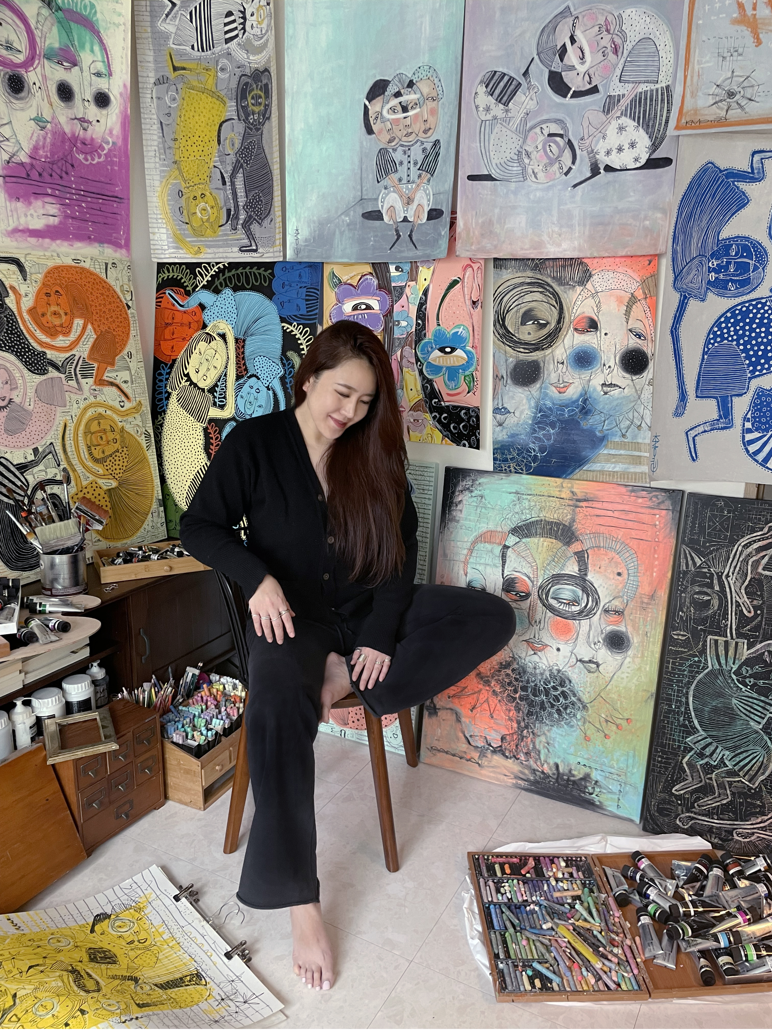
Yool Kim
You studied color at university, and your palette is very distinctive. What is your approach to color? What were you hoping to do with your degree in Color Studies?
I completed graduate studies in color science and worked for 10 years as a cosmetic product developer.
How long have you been painting? Who are your major influences?
Although I studied art as a young girl, I have been focused on painting this style for the past year and a half. At first, I was able to express my complex thoughts with face illustrations, and naturally came to a form with arms, legs, and torso. The influence of my paintings is me. I express the feeling of the moment and my condition in the most honest way, and I don’t want to hide it, so I project it into the picture.
Your paintings are heavily psychological, representing extreme emotional states, and yet they are also quite figurative and composed. It’s like there’s manifestations of the unconscious, but also a regulating order. What do you understand about the psychological aspect of your work?
A person like me changes from disorderly and complex thoughts to frame the world around them. One struggle I try to convey is to accept change and a longing for mental and physical freedom. I express this in my paintings. When I draw, I place importance on color, background, shape and emotion of the person, and layout. As a result, like the methods and rules of the Tetris game, random sticks coming down from the top are regularly fitted into the frame, and the complex background (to the world) expresses the desire to show that I stand out or coexist.
Your figures often have a dotted border and a dot on their faces? What do these accents mean for you? Are they symbolic or merely decorative?
I really like the dots and freckles on the face. I like the feeling of touching a ball. In my drawings there are always dots. Dots show differences in my drawings and signify change. Similar to the dotted line, it is an expression used to express salience and outstandingness. Even if there are no dotted lines in my drawing, there are always dots. Location or size doesn't matter. I think the thing that is unique to me, not the ordinary, stems from the desire to stand out.
You paint long, spindly hands, and a lot of your figures have only two or three limbs. This makes them somewhat abject, like maimed animals, but also adds to their appeal and mystery. What do you think about the body parts of your figures?
I want to let go of my limbs. My arms and legs symbolize heaviness, I use them by expressing different personalities and various moods by overlapping my complex thoughts on the faces I draw. There is no need to have two limbs, I want to break the rules of beauty set by the world. As long as I have just one limb to express freedom and make me known, that's enough. I think the meaning of “do what you want to do” has come to mean a lot so far as the body is concerned. I like to express motions that are impossible in reality, this results in drawing different human proportions, often those found in animals. There is a cat that appears often in my drawings, and although it has a human form, it also reflects the psychological part by comparing the inner heart and body to a cat.
Your paintings are one-dimensional and have prominent backgrounds. Some of your backgrounds are just one or two solid colors, while others are complex: patterned with checkerboard or lines or chaotic scribbles. What do backgrounds mean in your approach to composition?
The background is the world in which my present and past psychology are compressed and expressed. However, this world is not constant. Sometimes it is standardized as a single color, but when complexity fills up, it is expressed by giving variety to the color. In addition, graffiti expresses my noisy surroundings and compares the pain of my childhood to games, numbers, pyramids, dotted lines, circles, and X marks, recalling my unhappy childhood and expressing hope.
Many of your figures are half-animal or surrounded by animals, so they bring up questions of the human/animal divide. What do you want to express about the animality of humans (or vice versa)?
I never thought of separating people from animals. I want to reflect on the symbolism that stands out in the images and actions of certain animals. Cats often appear in my paintings, but in fact, I am afraid of cats. But to me, cats are queens and kings. I admire the freedom that comes from the strong, hard-to-reach, yet flexible gestures of cats. Cats have what I long for, something I am missing. I'm still obsessed with cats, but I don't know when that will change again. I change from moment to moment, and my thoughts are always on my tail, and I am also curious about what kind of creature I will meet at the end of my thoughts, and it is a task that I work to express.
Click Here ︎ to see Yool’s work.
Yool’s Instagram: @yool___kim
Interview by Christian Prince.
@chrstn_francis
Jasper Stieve

Numerous works from your collection feature scenes of a nocturnal cityscape. What is the allure of urban streetscapes for you–especially landscape at night? Is your work partially inspired by your move to New York City and/or the New Jersey cities that you grew up in?
I feel an overwhelming sense of solitude being surrounded by urban streetscapes. You play such a small role in this chaotic and disorderly maze. Comfort and hardship accompany each other. You can just exist. I’ve always been fascinated with that aspect, but making the move from my small hometown to the city was very formative. By simply removing society from the streets, the character radiates and still exists. There is something special about being the only person to experience the streets after hours, like being let in on some ambiguous performance.
Your most recent entry into Court Tree’s “Summer Feeling” group exhibition (as well as other works you have exhibited in this gallery) showcase airbrushed imagery. In what ways does airbrushing allow you to express your artistic vision differently than other techniques?
There are a lot of reasons I gravitate towards airbrush, but I would say the shading and luminosity you can pull off attracts me most. Those are two key components that bring my paintings to life. They’re always the last details I add. The pressure that comes along with approaching the end of a project is eased when you step back and see those details tie the whole thing together. It’s extremely satisfying and fulfilling for me.
Some of your most unique artworks are the ones where you create a ‘moving’ image encased within a vintage Fisher-Price Giant Screen Music Box TV. These toys were popular in the 1960-80’s, before your time, and so how did this idea come about? How did you initially come into possession of these toys and what inspired you to repurpose them for your artworks?
I got my first Fisher-Price TV at an antique store upstate in Hudson, NY. My late mother walked up to me holding it, knowing we both had an appreciation for obscure antiques. We were fascinated by the never-ending scroll of illustrations depicting the nursery rhymes “Row, Row, Row your boat” and “London Bridge”. I bought it and it sat on a shelf in my room for months. One day I had the thought of setting a stationary car to a moving cityscape background. I immediately dismantled it and got to work. Whenever showing these pieces I hear “I remember these things!” That’s stuck with me a lot. I’ve seen people interact with them and reminisce on how they haven’t seen one since they were a kid and mention the fond memories that come along with that. I discovered through those pieces that I enjoy making interactive work. It feels incredible to be able to bring someone to their adolescent state of mind.
Skateboarding plays a significant role in your life, and so can you tell us about how you first became acquainted with it? Who taught and motivated you to pursue this lifestyle? What was the hardest yet most rewarding skill to master? What are some of the biggest lessons you’ve learned through skateboarding and how does it influence your art practice?
Ever since I can remember I’ve always admired skating, but when I was 10 when a family friend named Noah took notice and taught me the foundations of it. He played a huge role in me getting into skating, and from there it was all I wanted to do. I couldn’t thank him enough. I think the hardest part of skating aside from skill, is excepting that you will always be learning. You commit endless hours to something that will beat you down and push your limits. It can be a very humbling, yet rewarding process. Skateboarding has taught me how valuable human interaction is. The friendships I’ve made over the years mean everything to me. My friends are my favorite skateboarders and they are the ones who inspire me the most to keep doing what I love. That being said I directly apply that perspective to art.
In your eyes, what are some of your biggest accomplishments? And what currently fulfills you?
Moving to New York has been one of my greatest accomplishments. It has been nothing short of life changing for me and will always mark a pivotal moment for my creative outlets and myself. That move is responsible for my first upcoming solo show at Pollyanna Projects , growth in the skateboarding world, and some of the realest relationships I’ve been able to make. Through all of the ups and downs, I’ve found a good balance of making art and skateboarding to keep me in check.
Last great piece of media (book/movie/show/music)?
A rotation of Bobbi Humphrey and Theo Parrish.
Jasper’s Instagram: @bigjasp
Interview by Tiffany Kang.
@by_inyoung
Mary Limonade

You paint in a variety of canvas sizes, with some as little as 4 x 5 in. to others more than triple that size.
Your small paintings are only small in stature, for they pack as much detail and evoke great feelings as much as any of your bigger ones. What is the charm in painting in such small sizes? Do you have a preference for painting smaller or larger canvases?
I worked a lot in my bedroom before which probably made me paint smaller over last years.My work on wood attends to be bigger and bigger as I have more space in the studio. I like the different scales, from very little size as small as a matchbox to big murals but I find small sizes more intimate. I like to paint very small places full of details and I like to paint big perfectly flattened spaces. I can't really choose one or another that's why I started to mix it. I have to tell that I'm easily bored and I need to have fun with scales to enjoy, I like to change anyway!I would love to make bigger works in the future but it's a bit more complicated because I paint on wood most of the time, and the bigger it is, the heavier it is. I could paint on anything else but I really like what it's feel like to paint on wood.
Are your paintings influenced by scenes that you’ve witnessed or are they scenes created from your imagination? Moreover, are the texts that accompany your figures conversations that you’ve overheard or personal anecdotes that you wanted to share with your audience? Are there specific visual elements or techniques that you consider signature aspects of your work, which make it distinctly yours?
Most of my paintings are part of memories. I like to mix them with thoughts from my daily-life and and references of my childhood or teenagehood. I paint places where I spended times, places which resonates inside of me. It's a mix of dreamlike elements and factual memories. Sometimes with hindsigh, nostalgia or the bitterweet feeling that remains. I don’t like to talk about my feelings, or just to talk. Painting words or thoughts probably helps me a lot in my everyday life. It helps me to talk about my internal feeling of loneliness or eternal anger that I can feel as an autistic person, how I can feel stuck in my body and my mind sometimes. I think that writing stuff helps me also to grief,
My mom used to say to me "You are such a grave", she's probably not totally wrong, but I try to express what I feel in other ways. So in my painting I can say "Fuck that shit" or "I want to die" without fighting with myself or hurting anybody. There are no consequences in my paintings, it's a safe world for me.
Some of your paintings quote music lyrics from a wide breadth of artists: from pop superstar Britney Spears to alternative singer-songwriter Beck and even extending to genre-defying singer Kimya Dawson.
What is it about these lyrics that resonate with you? And how do you choose which lyrics make it onto your final canvas?
Sometimes I use lyrics, I really like the way that quotes can resonate and be interpreted differently, it's playful for me to think about that.
The Britney Spears’s song is a good exemple, I realised I heard this song a million times as most of us on this planet. We always sang it as a light song, thinking about Britney at school with her chewing-gum. But as soon as you made somebody else says those words, it feels just totally different, more deep or dramatic. I think it's really interesting and I like to think about how people can feel the same and litteraly different about the same words. How that context works is important.
Also, I'm very impressed by song-writers and poets. People who are into expressing feelings with words. I like to play with my interpretation of what those people wrote. I came from a musician family, music was always around me. I listen to a lot of different kinds of music, for me eall music is interesting in one way or another.
Everyone has favorite songs, mainstreams or not, in their life, songs makes them think about someone they love or a special moment. That's why there are such connections with my own memories and feelings that I try to express within my paintings. It helps me express my own feelings too. Music brings so much emotions, from immense sadness to tremendous joy and that's a way I found to share it too.
You identify your art within the genre of naive painting, and so what do you think are the strengths (and possible weaknesses) to being a self-taught artist? What was the journey that led to you establishing your art practice? In addition, what are some lessons or tips that you have learned, in which you believe that no formal art education could have taught you?
That's a good question. I always felt mixed feelings about it. When I was younger I always wanted to learn HOW to draw or paint, going to an art school or so. Unfortunatly (or fortunately I could say), I left school at the age of 14 or 15.
I had a lot of friends who were into art and graffiti. I always wanted to try everything and I felt for a long time that I was not able to do anything long enough to be good at it. I was kind of waiting for learning the special thing which would be mine and felt bored before I manage to have a good skill. I did a lot of different things in my life from working with disabled people, teaching french to immigrant people and even make-up on advertising sets for tv. The good side of it is that I know a bit of everything. At the end, I found that what I was looking for was there since forever. I just had to paint to discover that the key is just to do it. Doing what you want to do.
What I mean is that the journey was not what I expected. I was lucky enough to cross paths with Jiem 10 years ago who was really enthusiastic about my work and helped me to focus and not to give up on lower days. That's when I started to think again about painting as a serious thing in my life. The mainly strenght to be a self-taught artist is that everything is possible I never ask myself if it's the good way to do it, I just do it. When I paint a scene and I don't have space enough to fit everyting it, I do it anyway. I don't think an academic artist would do this way. I studied music at the conservatory, it feels almost impossible to improvise as soon as you've learned such strict rules. I guess I won't paint the same things at all if I would have gone to art school.
Not having techniques sometimes feels frustrating of course. At some point I felt in love with naive-paintings which for me is the most playfull way to paint.
You frequently collaborate with the artist JIEM, and your art styles blend so seamlessly to create really harmonious, well-balanced paintings that still contain unique details that attest to both of your personal styles. How do you make sure that your collaborations represent both of you equally? And is it always equal or are there times where someone’s style or idea is represented more than the other? How do you find the right balance in collaboration? And what strengths does JIEM have that you think personally adds to your work?
Yes, we like to work together. It helps each other in so many ways!
I guess the way it feels harmonious is because we have common passions and interests, we love the same aesthetic, we have a lot of references in common that build our common universe. It's not always equal but it's not a question for us. It can happen that one of us made 90% of the painting itself. There is no question of who did what. There is no mystical recipe. We just do it.
Each of us has our own strenghts of course, for exemple I'm able to fit anything I want in one picture which can make a weird combination. Jiem is the master of cloudy skies, accumulation of things and lively spaces.
I also think that painting together helps us a lot to understand and define our personal approach and what we would like to develope individually in our paintings. Jiem is more into dense and very busy paintings in a way, more in touch with style, without unnecessary details to understand the painting. And I like empty and flattened spaces, sometimes mystical, dreamlike environnement with very few detailed elements. I think the strenghts Jiem adds to our work is rawness, new colors combination that I would never do. It also adds surprises too. It's always a good feeling to see the progress of a painting when the other one works on it.
Last great piece of media (book/show/music/movie)?
Few weeks ago, I read "Fun Home" from Alison Bechdel. It's a comic book about the author's childhood in the family funerarium home in Pennsylvania and her relationship with her father. It feels like a maze into the deepness of the intimacy of her family secrets and connections. It resonates a lot with my feelings and history in a way. I really like autobiographical comics. The drawing itself is really cool also.
Click Here ︎ to see Mary’s work.
Mary’s Instagram: @marylimonade
Interview by Tiffany Kang
@by_inyoung